SAINTS WERE MADE : A Postmortem
WHO?
I am somewhat, the single developer behind the titles published on itch.io under that name. My first creation, I Make Saints, left more than a few players and Youtube spectators confused, perhaps even disgusted. I figured it was time to share some insight into the creation of the title, share what it means to me and maybe inspire other people to take up game design as I did. It is a fun pastime and rewarding in surprising ways.
WHY?
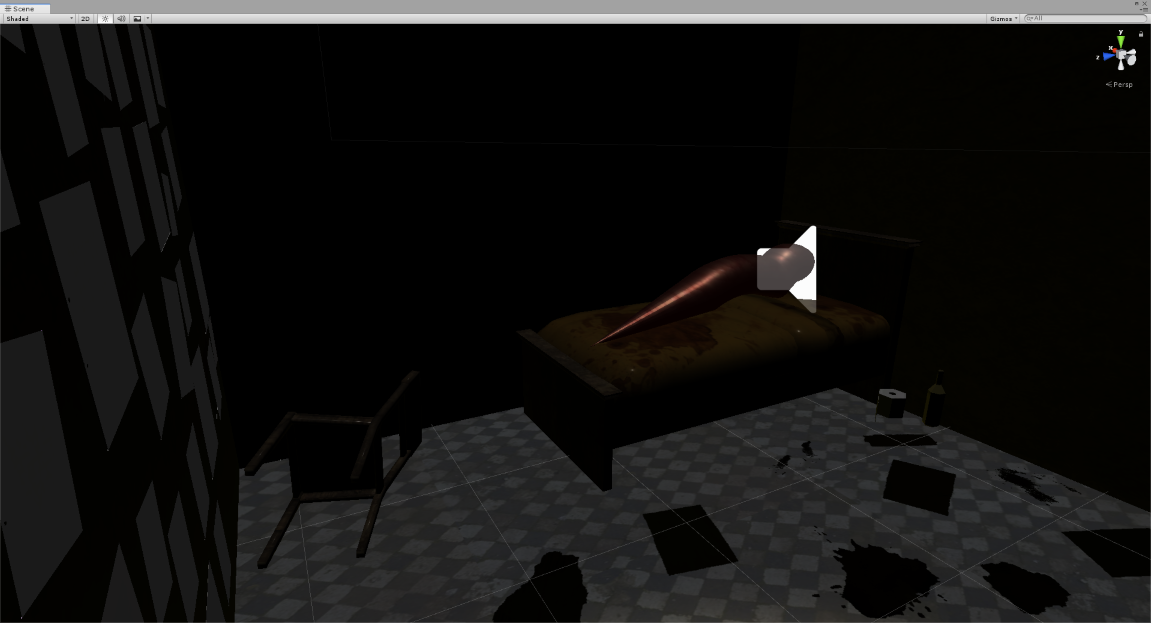
In the last three to four years, I've had a growing interest in the alt-game movement (or whatever it wishes to be called). Whereas some players see walking simulators as a waste of time, I found an entire genre of games and experiences able and willing to explore more complex feelings than the usual schadenfreude offered by more action-oriented titles.
I've long had dreams of games where you just...walk. Walk and see. Just explore. Games existing only for the precious sense of place they could provide. Devs like Kitty Horrorshow and Moshe Linke opened my mind to ways of approaching game design without feeling like a loner for having this desire for more relaxed, lonely experiences.
So I ended up wanting to make something, but not knowing how to make it, and knowing even less what it would be about. I wanted it to be personal. I wanted it to be a little dark. Yet I find that games about depression, lost love, introspection and the likes are often heartfelt, but a dime-a-dozen on indie sites such as itch. I had to find something that spoke to me, that troubled me sincerely, if I wanted to make an impact. I ended up finding something darker than I first expected.
WHAT?

So what is I Make Saints about, exactly? If you ask any player, the answers might differ slightly but will all gravitate towards a certain...direction. To say more would spoil the experience for those who haven't played, and I am not interested in giving clear explanations of the events the game narrates. I feel they are pretty self-explanatory if you search for every note scattered in the game. But if you ask me what it's about, I have a very different point of view to offer.
I Make Saints is about the failure of art to redeem a lost, broken person and the guilt that remains to fill the void left by that failure.
I came across an old criminal case which brought up mental health issues for the first time in local court history. It opened up the discussion about whether or not a criminal with prior mental health issues deserves the death penalty or could be spared the capital punishment in favor of therapy and rehabilitation. It is a sensitive and complex subject, and I understand that opinions about it are as varied as there are people analyzing it.
Now, the crimes referred to in I Make Saints are inexcusable, let me make this absolutely clear. They deserve punishment, and in the case that inspired the scenario of the game, they were properly punished. But this was also a case of a broken person, with a dark and sad personal history, doomed to repeat the acts that broke them in the first place. The nuance is as such : while this case does not excuse the crimes, the mental health of the criminal helps explain why they did what they did.
This is where art comes into play. It was revealed, during the real-life trial, that the criminal dabbled in some art and poetry. That creative output was awkward and daft. This struck me as odd. We are so used to seeing criminals as articulate sociopaths that use art to excuse their acts, especially in pop culture media. Yet this is a case where it seemed the criminal was sincere in their amateurish creations. I firmly believe that art can heal, that art is a somewhat safe sandbox to explore personal trauma and, perhaps, come out a better person. A healed person.
But art had failed the broken criminal. The wounds were too deep. And thus horrible crimes were committed. As naive as this might paint me as a creator, it came as some sort of shock. And if it shocked me, and if I held on to that initial reaction, I thought I could encapsulate this feeling and transpose it in a game.
I firmly believe that you have to feel the emotion you want to inject in the game. Is your game sincerely fun to you? Is this sad character really twisting your heart in a knot? Writing the myriad of dark and morbid notes found in the game, I went to dark places in my mind. I came out of those writing sessions moody and quiet. Those were not comfortable moments.
If you feel disgusted by what you've read in IMS, trust that I was feeling the same. Self-imposed guilt and darkness were the only way I felt I could attain the tone I wanted for the experience. I am unsure I would explore the mind of another like this again. In my following titles, I started to turn inward and explore my own failures, my own wants. We'll get to those in time, in their own Postmortems.
HOW?
I do have a background in designing games, but I never actually made one from the ground up until I Make Saints. I still haven't, in a way; I'm using all sorts of assisting tools to get the job done.
Oh, and by the by, let's get this out of the way : here I refer to IMS as a game, a software or an experience. Those terms are all interchangeable, in the case of this Postmortem. This is simply because I am sincerely having an issue properly identifying the kind of...thing that is IMS. I knew it would be openly derided if I called it a game (there is item-collecting, basic door and key mechanics and a labyrinthine environment, but is this enough to make it a game?) so all official communication called it an interactive experience. I concede this makes the whole thing sound pretentious, more so than I intended it to be, but I felt it was overall better than to call it a game. However, IMS wasn't spared snarky comments online from both camps : people finding the interactive experience label indeed pretentious, and others complaining it wasn't properly a game. Can't win 'em all.
As far as game engine goes, I looked at my favorite indie game creators and found out most, if not all of them, worked with Unity3D. I came to appreciate its community support, ample asset store (with lots of free stuff!) and the rough grungy aesthetic Unity can provide with shaders, filters and whatnot (as opposed to, say, Unreal Engine's glossy look). I felt the engine was the fastest way to achieve what I had in mind, so this is what I went with. I do not regret my choice.
Now, most of the design of IMS comes from limitations, frustration and impatience. Perhaps some of you will relate to this, but I am a creator with a short attention span. If I don't perceive progress is being made, I get frustrated, anxious and stressed out quite easily. It plagues every title I have made so far. Every time you play a somewhat game and you feel like something cuts short, or doesn't work as well as it could, or doesn't have the effect / impact it could have, you can blame this unfortunate part of my brain. At some point, I just need to get it done and work on the next aspect of the game. There is a constant battle between perfectionism and creative anxiety in my mind. The games are the result of this conflict.
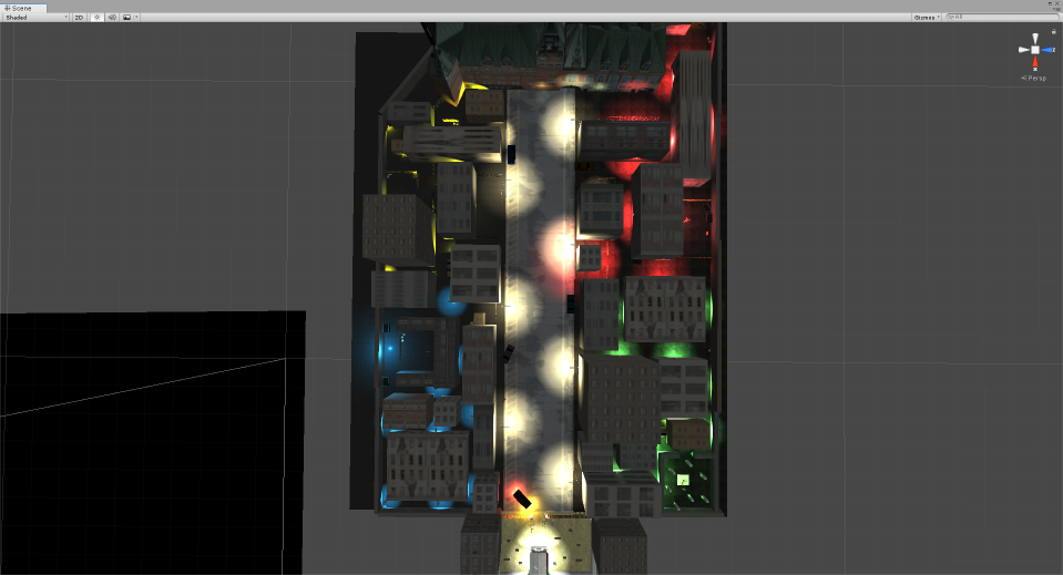
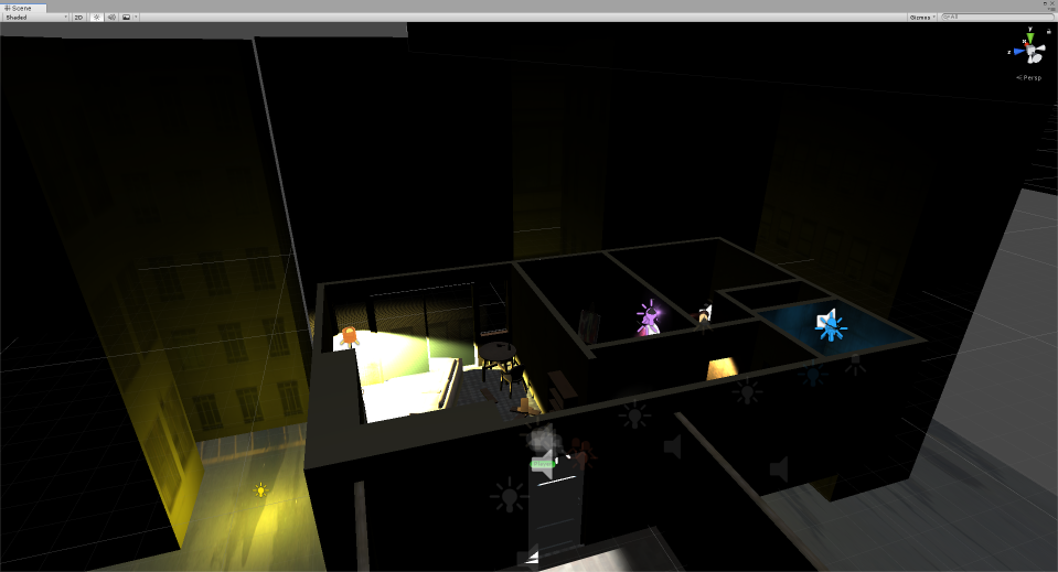
In the case of IMS, the city is made like a labyrinth because it was the easiest type of game I could come up with. Anybody can open Unity, throw a few over-sized cubes on a plane and call it a game. So, yeah, this is what I did. Which is fine because, oh lord, DO I LOVE CITYSCAPES.
I love urban environments. I love the ambiance of a city asleep at night. I love the neon lights reflecting on every dark surfaces. This will become apparent as I create more games, and might be a pitfall I'll have to be careful to avoid in order to not become too predictable as a developer.
The layout of the city was made in such a way that there was no dead end...except one. At one specific spot, there is a dumpster in the way creating a cul-de-sac and if I ever go back to tweaking the game, I'll definitely get rid of it. The intention was to make it feel like the player is lost but doesn't ever have to backtrack to get out of the labyrinth.
Also, a few details were added to the environment to make four separate districts, to reinforce the goal of collecting four different cards (or icons, more specifically). Each part of the city not only is color-coded, but the lighting sources are different (street lamps, gates on the ground, etc), their layout is slightly different, one of them has ash in the air...all to subtly indicate to the player that they entered a new zone. This is a technique I will elaborate on in my following title, The Shape On The Ground, which is a bigger, more complex cityscape.
And you might have figured it out by now, but yeah, the game has a low-poly aesthetic mostly because of my limitations as a 3D modeler. Just so happens I like it that way too, and the 32-bit inspired look will make a comeback in future titles. It's just easier for a one-dev operation such as somewhat.
WHICH?

On a technical side, I used John's Art Horror Development Kit from the Unity Asset Store as the basis for workable menu / player character / readable notes mechanics. I notice now that it has been removed from the store (and I have no explanation for that), but a lot of similar assets are still available, if this is the sort of all-in-one solution you are looking for. I am now teaching myself how to program those mechanics by myself, but at first it all seemed very intimidating so I wanted to skip the anxiety of having to learn everything at once. The game never would have taken shape if I didn't have this asset to manage the biggest parts of the gameplay early on. As I admitted earlier, blame the short attention span.
I started using Evasion Games' GameFlow as well for additional programming. It is now a big part of my game creation, and I somehow prefer it to PlayMaker, which I found too obtuse for a first-time user. GameFlow is akin to the RPG-Maker-style programming, if that makes sense. It did to me, which is why it was easy to integrate into my workflow. I don't make complicated games (and I don't really intend to create complex ones in the foreseeable future), so it fits my needs perfectly for the time being.
I also already dabbled in music making in the past, so I know my way around a few DAWs, but my preferred tool of choice is Ableton Live. As for texturing and material editing, I can't seem to let go of Paint.NET which, I'll concede, is not the best image editor around, but it's the one I am most comfortable using. Finally, sounds were edited using Sound Forge Studio (which you can get really cheap through either Steam sales or Humble Bundles if you are patient). It is my understanding that most creator get by with the open-source Audacity, which is a pretty good software.
WHEN?
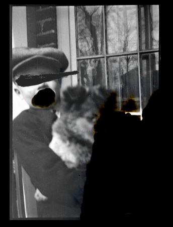
When I had enough of the game to show, I started sharing screenshots and dev updates on itch (which, as it turns out, is a bad idea, since by the time the game is released, it will be sorted on itch.io by the date of the game page creation, so it'll be way, waaaayyyy down the list of new titles and nobody will see it). I decided then to develop an admittedly pretentious mystique around the game. My dev logs are exercises in obfuscation and minimalism.
I figured I had to match the tone of the game through those updates, and keep it consistent. It is a game with a heavy subject and I believed that anything else than deliberately stilted grimness wouldn't catch anybody's attention.
I like that feeling of stumbling upon a weird game online. That moment where you feel like you're the only one who ever played it, that you weren't meant to play it. And if I am being honest, I hope I could instill that sentiment in the experience of IMS for some players; it would be the software's greatest accomplishment.
This idea of adopting a tone for all communication about the game would eventually be adopted for all of my games. Dev logs for The Shape On The Ground are all formatted similarly, with three rhyming words in their title, similar to the three choices for every question found in the game itself. My upcoming game [SPEK.TAKL] has another gimmick where each dev log is made to look like a small insert article taken from an old TV Guide magazine.
I love doing this as it becomes its own experiment in helping me find the correct mood for the game while development happens.
I also only recently decided to start using first-person pronouns when communicating about the games I make. For the longest time I used the 'we' pronoun to keep this vague aura of mystery, which was mostly important for my second title, The Shape On The Ground, to make it seem like a shadowy and uncertain 'group'.
WHERE?
There is a very intimate pleasure in watching somebody experience your creation. Whether it is showing a movie you've shot, sharing a song you wrote, or knowing there are people out there reading your blog; it's great seeing the impact your creation has on a first-hand basis.
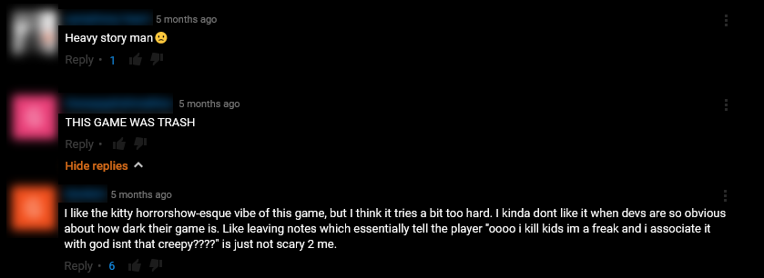
I felt that when I started watching Youtubers play IMS. As I was making the game, it became quite clear it wasn't an experience tailored for online video platforms. The subject alone should scare away Youtubers careful about sensitive content. Perhaps if I intend to live off of game-making, I should tone it down, but most of my current ideas for future titles are counter to that. We'll see.
I'll make a grand statement and presume that most devs (indie or otherwise) are obsessed with watching online let's players trying out their game. I can't be alone in this. somewhat still isn't a popular brand name, so the small number of let's plays available of IMS is definitely manageable, and I swear I watched them all, and read all of the comments. I can't help myself.
The response for I Make Saints was interesting. Generally, the reaction was positive, with a lot of people involved in trying to make sense of the final word the game leaves the player with. It was not intended as a big 'mystery' (I mean, it is pretty obvious), but it was meant to put the word in your head by force, and to give you the unfortunate opportunity to reflect on it. Hopefully you are troubled and disgusted by it as, let me say it again, I do NOT condone the actions described in the notes found in IMS.
For an experience I had no hope would find an audience, IMS left some impact. The subject matter and the walking-simulator nature of the design should be enough to turn back most players, but it was downloaded nearly a thousand times as of this writing. Online, most comments were divided, all over the place, but it seemed to leave nobody indifferent, which is more than I expected. Most were shocked, others thought it was shock for shock's sake, which might be a fair point. I did choose a difficult subject, prone to visceral reaction in people's minds, but I tried to not revel in it; to those people, it seems I failed and I passed off as some sort of edgy poseur. Not that you'll ever read this, but I'm sorry you got that impression.
As for profit, well... Let's just say I hope you are not into making walking-simulator games about guilt-ridden killers and expect to live off of it. The way I saw it was like this : being my first video game, I never once considered selling IMS. I was sure that NOBODY would want to pay for it, and time has proven me right. I attempted an original formula of 'selling' a version with bundled royalty-free soundtrack, but that did not pan much. The game received a little more traffic and attention when it got some press (covered by PC Gamer without any action from my part) but it did not move the meter in terms of profit.
CLOSING THOUGHTS
Completing IMS, just getting it done, and seeing people play it, reading comments about it, it was quite a trip. I decided I wanted to live it all over again and made a second game. And now, I am preparing the finishing touches on a third. Each title has its moments of glory and anxiety-filled nights, and at the moment, I wouldn't trade it for another medium.
I realize I did not answer every question raised by I Make Saints, but I like to maintain some mystery around it. It needs blank spots for the player to fill; if not, it will just be another generic horror title quickly forgotten. Hopefully IMS' horror stayed with you a little while after you played it. I suppose it sounds mean when I put it that way, but it would make me happy.
Get I MAKE SAINTS
I MAKE SAINTS
guilt simulator
| Status | Released |
| Author | somewhat |
| Tags | ambient, artgame, Atmospheric, Experimental, Halloween, Horror, Low-poly, Psychological Horror, Singleplayer, Walking simulator |
| Languages | English |
More posts
- Final Update (Hopefully!)Apr 12, 2021
- A New Release By SomewhatJul 23, 2018
- Another placeMar 14, 2018
- macOS and Linux versions now availableFeb 06, 2018
- Smaller SaintsFeb 04, 2018
- Time for you to make SaintsDec 03, 2017
- Freeing the SaintsNov 27, 2017
- Black snow fallingNov 20, 2017
- An abandoned carNov 06, 2017
Comments
Log in with itch.io to leave a comment.
I know this is old, but I just read this and really enjoyed the retrospective on your first game! Honestly, I played 'please' and 'please follow' first of your games (I will call them games) and was struck by the sound and visuals and how vaguely uncomfortable but completely enthralled they made me. I technically streamed 'please' for some of my friends, but it was silent and they only communicated in Discord. I find it very strange that people would stream them to a wider audience. They really feel like... Introspective pieces and don't seem to mesh at all with what current horror game stream culture is like, but also, I do understand wanting to share experiences with people. Anyway, I did enjoy IMS. It was viscerally uncomfortable at times, but still well worth the experience and I'll be thinking about it for a while. (And in particular how much better the subject matter was handled than Outlast 2...) I'm still saving SPEK.TAKL and The Shape on the Ground for other nights when I need something subtle and unnerving, it's nice to know Unnerving Introspective Walking Sim is a flourishing genre and powerhouses of creativity such as yourself are in it making good games!
Thank you very much for all the kind words! IMS was made with the means and technical knowledge I had at the time, and so I put all of my chips in the story / ambience of the game. I still stand by what I wrote in the postmortem, though : I would not touch that subject again, nor do I want to dive deep into this sort of darkness again. Hopefully, the game ideas I have for the future will be as gripping without being as harrowing, and will keep you coming back for more.
Also, it took a lot of time to get around to it, but I am warming up to the idea of openly advertising my games as simple / no death walking sims. Like, "safe horror"? Does that make sense? Anyway, I am glad such games can find an audience. And even though the games I have made up to now are lonely experiences, I understand wanting to share them with friends. I can only hope I make good games-as-conversation-pieces, if nothing else.
Wow, this is exactly what I was looking for. I'm a solo dev myself. Can I ask did you hand paint the textures for the game? This is something that I'm struggling with, as I'm not a gifted artist myself. Love the style!
Thank you for taking the time to read this. I made it as a beginner solo dev myself hoping it could help others as well.
I did not handpaint the textures. I found most textures on Google Images or Bing Search (surprisingly good search filtering options). Of course, don't use any image for a texture. Make sure it is repeatable (search for 'seamless texture') and free for commercial use (filter search results by 'free to reuse with modifications').
Otherwise you can always make your own textures by taking pics with your mobile phone and making them seamless with a photo editing software (such as Photoshop, or other free open-source options such as Gimp or Paint.Net).
As a solo dev, you have to develop some skills to fill the gaps an entire dev team would normally occupy. Don't be afraid to experiment and just make textures as best you can. Even if you don't end up using them, never see this as wasted time, as you are teaching yourself to be better at it!
Wow, man. This helps a lot you have no idea. I’ve never made a game before, so all this is really new to me. But this helps so much! So thank you for taking the time out to respond. You’re right, you have to fill in those gaps yourself as a Solo dev. I’m making my first game right now, and I’m definitely learning a lot. My fear is frustration, as my time is quite limited and I fear that I will never make a game. I come from a film background so I’m more in line with believing that the more projects I complete the better the dev I will be. And full disclosure, being a game dev is something I want to do instead of my current job. I’m sure there’s a lot of people who are in a similar boat but like I said, this helps a lot.
You mention visual scripting, and if I can ask what did you do about the shaders that you use? Did you get them from the asset store? If so, which one would you recommend as I’m looking for the same retro look you go for in IMS.
No problem. Sounds like we are in a similar boat. :-)
About visual scripting, I'm just not a coder, I don't know the expressions and how to type it, but I believe I understand the logic of code. And as such, visual scripting is a way to create code without writing it. It's much easier to explain and understand visually, so look up visual scripting tools on Google to get a quick and better picture. As I work with Unity, I tried a few options such as PlayMaker, Bolt and GameFlow before settling on GameFlow (which is very similar to RPG Maker, as it's just a series of commands read from top to bottom). Bolt is more like actually coding without having to type (I found it very intimidating for a beginner) and PlayMaker is forcing everything to be a state-machine (you tell every object in the game what to do at all times, and what they do changes depending on the situation, making the object change from state to state... hope that makes sense). PlayMaker is the most popular option, and has extensive documentation online, if you want to get into it.
As for the 'retro' shaders, you have a few options. I personally use Flashback94 (found on the Unity Asset Store), but most devs I know started out using DSoft20's PSX RetroShader, which is free : https://github.com/dsoft20/psx_retroshader
There is also Keijiro's shaders who are pretty popular, make sure to check out their other stuff : https://github.com/keijiro/Retro3D
Recently, fellow low-poly dev LeakyFingers made a similar shader for Unity as well : https://leakyfingers.itch.io/retro-3d-shader-pack-for-unity
So your options are pretty wide opened. Test a few of them and settle for the one with a UI that clicks best with your brain. Happy game making!
Seriously, I can't thank you enough for your message. Being a solo dev, you need all the help you can get. I purchased your bundle, from one dev to another we need to support each other! :)
I think that your reflections are extremely healthy and I can tell that creating something you believe in is very gratifying to you. That honestly makes me quite happy. On watching let's plays, though... doesn't it get weird? I have recently published my first game and after let's play number 10, all I can see are my own failures after a while. Through other people's videos I eventually just fixate on my project's limitations and blemishes. Has that ever happened to you?
I'm very intrigued by your games, especially how you describe this one, and I'll be sure to play soon.
I have the usual confidence issues everybody has (coupled with a very strong impostor syndrome), but I am obsessed with making sure what I do touches some people, leaves a mark, you know? So yeah, I might be full of myself on this, but I love watching people play my stuff. Is it weird? Probably, I'm opened to that interpretation.
It does happen that I just see the flaws and blemishes in videos of my games. Watching let's play of them, I often see bugs that I couldn't find before release, or even more subtle stuff like players not catching hints (environmental or design-wise) that I thought would be obvious. It's awful.
But that's an opportunity to be honest with yourself. Like, you KNOW why that bug happened or why that hint isn't picked up. Only you truly know where your talents as a game designer or coder or modeler begins and ends, and the true (and often banal) justifications for it ("i couldn't make this work", or "this was my second best idea because I couldn't implement the first one", or "I just didn't know" or "I didn't know better").
What needs to be done then is just persist in making more games. Let go of that one (unless you can stomach keeping working on one title for a few weeks/months after release, I personally just can't) and concentrate your efforts into making a new one. You'll pick up new tricks along the way.
I'm kinda taking for granted that we work in similar ways (lone dev, doesn't know coding, not a lot of time to put into creation), so I might be wrong on that. But I'm one of those people who believe that there are more lessons in failure than in success, and that a finished project is worth a million times more than the greatest idea in your head.
Keep on going, man. Rot was really interesting. Did I pick up some Kitty Horrorshow vibes in there?
You absolutely did! It was really inspired by a handful of games and that includes Anatomy. I definitely agree with what you say about just persisting. I don't even really want to go back to Rot and fix it. I think the best remedy to that situation is just to make another game that improves according to the blemishes and criticisms of the previous one.
We are very similar devs. I'm an interactive media student and I don't have nearly as thorough a knowledge of coding as a CompSci student might, and a lot of what I learn is from the internet (particularly YouTube). I also don't find it too frustrating, though, as it kind of forces me to either be creative with my limitations or to learn on the fly which I enjoy. Thank you so much for taking the time to reply, by the way!