ARCANE GRIEF : A Postmortem
THE FOOL
---
Hi, I am the sole developer behind the name somewhat and I am currently going through the games I published and providing postmortem commentary and insight in their development. Here, we will take a look at my second, and most successful title to date, The Shape On The Ground.
After the difficult creation of my first game, I Make Saints, I wasn't as willing to explore the mind of someone else in order to create a new game experience. I figured there was enough personal material in my own head to draw inspiration from and still produce relatable work. I simply had to have more confidence in my own observations and ideas. So I started being attentive to my media diet and to the events happening around me. And as always, life has a way of steering things in peculiar directions.
What started happening was death.
THE DEVIL
---
Something happens when you get older : people around you die. It sounds obvious, and it is. But with larger families (grandparents, aunts, uncles, cousins close and far) come the realization at some point that people die often. In the space of a year, I was exposed to the death of at least 5 people related to me, and it changed a lot of things. It informed opinions, changed perspectives, introduced difficult conversation with relatives.
It became clear to me that I had a different relationship to death and grief than most of my friends and relatives. I grew more passive (I hesitate to say 'more accepting' because perhaps I'm just accumulating psyche damage over time unconsciously), death just seems like a thing that happens and I'm okay with that. There is obviously a lot to unpack here and this might not be the ideal forum to discuss this, so let's jump straight to the point of this whole aside :
The Shape On The Ground is a game about grief.
Grief in its many forms. Confronting and accepting loss. Not only the loss of a person. But also loss of possessions. Loss of love. Loss of limb. Loss of ambition and goals. How do we, both as individuals and as a society, deal with the unavoidable fatalism of expiration dates for people, objects and events?
THE CHARIOT
---
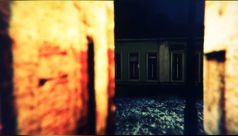
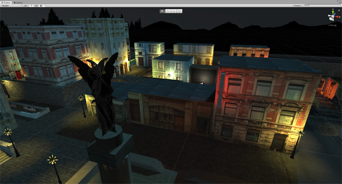
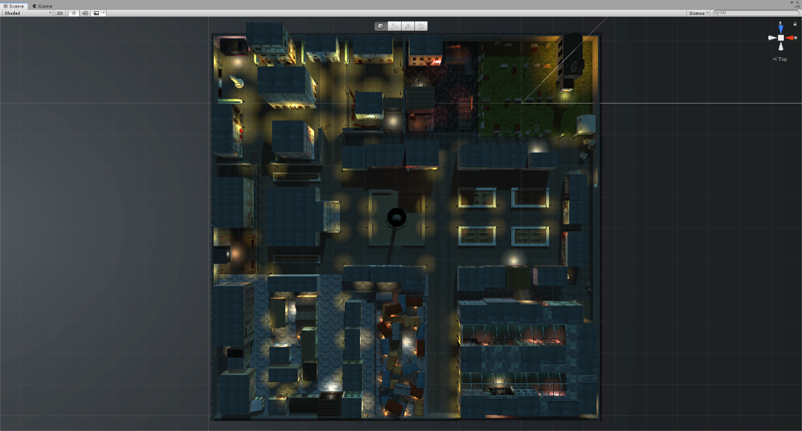
The actual genesis of the game was not a self-reflection on grief, though. Initially, I just wanted to create a better city than the one found in I Make Saints for my own entertainment. As I explained in an earlier postmortem, I love city environments, I love recreating a sense of place to the best of my abilities. As creepy as the unnamed city of TSOTG is, I hope it was a fun place to be for players.
At some point during the creation of this environment, I became so involved into it that I thought it would be a shame to not turn it into a game. And thus began a whole new process of creation for me, articulated around two main development rules.
The first rule was free-form, instinctual creation. For the first month or so of producing TSOTG, nothing was planned. The fact that it's a test, that the questions are presented as stations, the whole paper collage aesthetic, none of that was planned, it just...happened as I was adding more and more to the environment. It became a work of my subconscious, just accepting every first idea I had unless a better one came along later to overwrite it. As we'll see later, letting the subconscious speak became a big part of the theme of the project.
THE HIEROPHANT
---
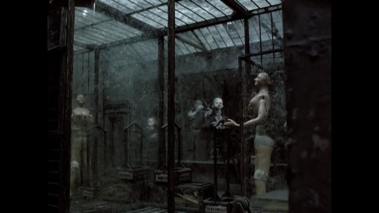
The second rule was to maintain a fixed 'culture' around the game. To amass a certain number of works by other artists and to consciously decide that these were going to openly influence the creation process. This means that an 'official' soundtrack playlist was created, for example, and played during long sessions of working on the title, specific books were bought and read, etc. I included in the Read Me file packed with TSOTG a list of works I kept as a result of this research effort. In it you can find musical acts such as Sidewalks and Skeletons, reference books about the work of visual artist Joseph Cornell, movies from stop-motion animators the Brothers Quay, etc.
And so, the fixed culture of the game informed the theme, visual elements and overall ambiance of the experience. I had a great time approaching production that way and I willingly repeated the process for the following game \SPEK.TAKL\. This process has its flaws, which will become apparent to me on future projects, but those will be talked upon in my next postmortem.
THE WHEEL OF FORTUNE
---
I integrated new tools into my game making with this project. Keeping the Unity game engine as the basis for the project, I started doing more serious 3D modeling with the ProBuilder set of tools. They are limited tools, and I am unsure I would recommend using only those tools for modeling your game (even though it's exactly what I did), but the skill level I was at for TSOTG was quite perfect for it, and it served its purpose well.
For the entire test portion of the software, I decided on using Fungus, as it could manage text, UI and variables. From my understanding, it is made for visual novel style games, but it fit my needs perfectly. I have since taught myself more about Unity UI stuff, and I don't think I'd use this asset now if I had to make a new quiz-type game now. The rest of the logic was implemented using the visual programming asset GameFlow, that comes highly recommended by yours truly, especially if PlayMaker didn't click with your brains, as it failed to do with mine.
For the rest, the usual suspects are back, using Sound Forge for audio editing, Paint.NET for visual editing and texture work, and Ableton Live for music.
TEMPERANCE
---
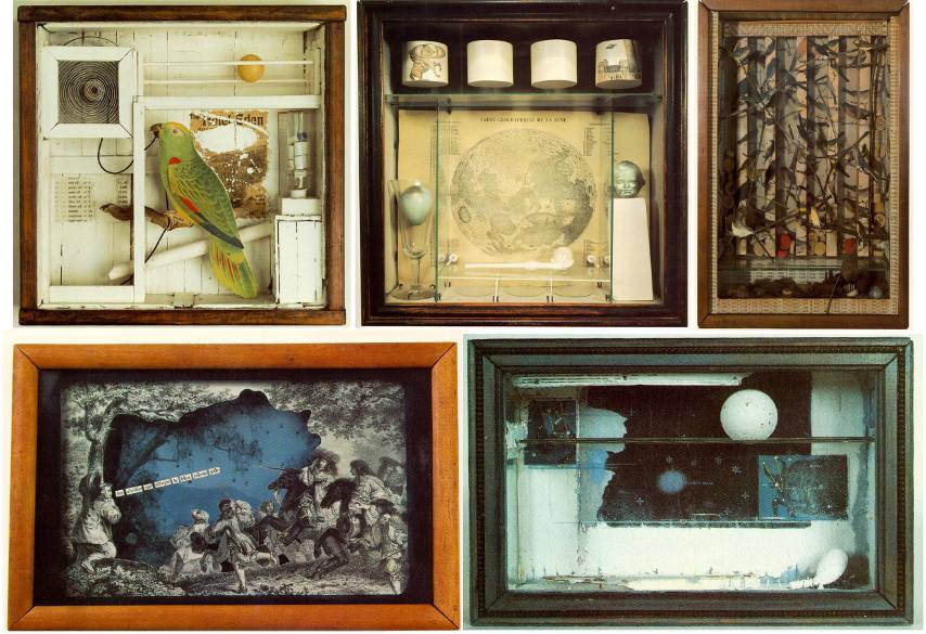
While on the subject of visuals and music, let's go through the stylistic choices that defined TSOTG. I quickly became enamored with Joseph Cornell's shadowboxes, and it influenced a lot of the design. The main idea for the environment became : let's keep everything in the game universe on the same scale as one of those shadowboxes, which are often about 12in X 12in X 3in in size (typical average dimensions for this sort of medium).
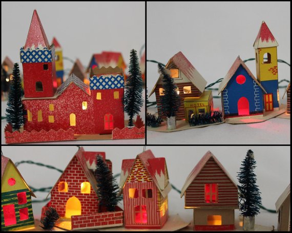
Textures were adapted to look like a miniaturized cardboard town, not unlike vintage 50s Christmas village miniatures. The camera had its focus set deliberately off, concentrated on a mid-range focal length to reproduce the effect of a macro lens, to accentuate the idea of the miniaturized town. Now, I know this choice wasn't a popular one, and that many players felt it was disorienting, or at least unusual. Still, I'm sticking to my guns on that call, and while I did tweak it after releasing the game, I will not remove it; it's an integral part of the desired aesthetic.
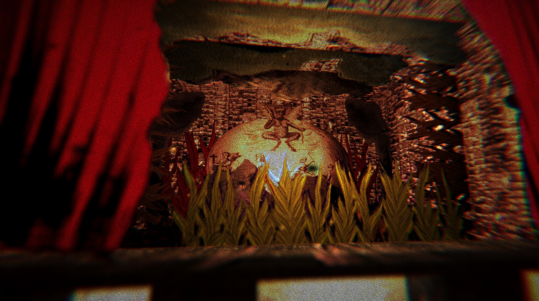
Early ideas included having the entire floor of the town being a huge actual map, with street names written on it, and 3D buildings just added on top of it, to really sell the arts & craft 'manufactured' theme, not unlike the first scene of The Street Of Crocodiles. In the end I went with having more credible but plastic textures for the ground, thinking that some of them, such as the cemetery's deliberately flat-looking grass, would have the same fake effect I was looking for.
As for the music, I also wanted a unified theme, or sound, to it. Influenced by the gloomy and mysterious soundtracks of polish stop-motion films, I chose the waterphone as the main instrument around which to create the soundtrack. If you do not know what a waterphone is, look it up, it's pretty cool (and has actual water in it!). It's the classic musical tool to create those droning horror movie soundtrack howls. I looked into actually buying one and playing it by myself but, egad!, the prices are prohibitively high for an instrument I intended to use on only one project. I settled on sampling the instrument, using different sources online, and I believe this turned out to be quite fine. It helped conserve the 'live play' sound I was looking for, while relying on synthesizers for the rest of the music.
I also peppered the soundtrack with public domain religious chant samples (female choirs and male Gregorian chants) and Tibetan tingshas to really drive in the spiritual angle of the experience.
The only issue I have with the soundtrack in its current state is the main piece, the one that plays in the town environment. Although I've heard some positive comments about it, mainly about how its droning nature fit the exploratory / introspective feel of the software, this piece was intended as a placeholder I never really got around to change. Blame my short attention span and / or creative anxiety. I would definitely change it if I ever dove back into the game files with enough time and interest.
THE MAGICIAN
---
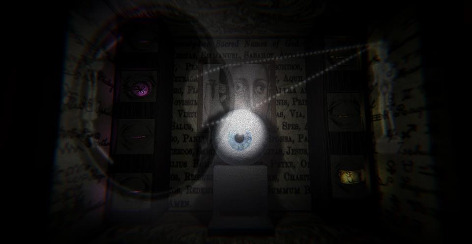
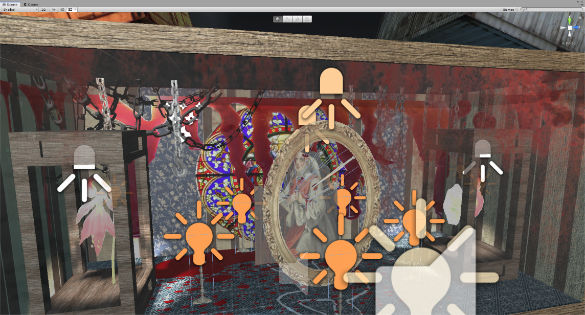
There are ten shadowboxes in TSOTG. We can also call them questions, or stations, or dioramas...I've never quite settled on a name myself, although shadowboxes is the term that made it into the press kit. It was fun making them, letting my subconscious do most of the visual design for each. Highly influenced by Joseph Cornell's work, as stated above, I wanted each shadowbox to have this material, tactile feel to them. Like you could reasonably conceive that they existed, short of being animated perhaps.
Speaking of which, I realized early on that they needed to be animated, and that motion could add its own layer of meaning to a given shadowbox. It's one thing to see the Devil sit atop a burning landscape; it's another to actually see the fire swell and move to really sell the ravage it can cause. Linked to the animation is the sound. Great, excessive, obsessive care was given towards creating a precise soundscape for each diorama. Each part that is animated in every station has a sound related to it and can be heard when the player stands near it. I intended for it to add to the physicality of the shadowboxes, to make it feel as if there was a credible mechanism at work in making them move. On top of every little squeaking nook and cranny, I added a larger, lower grumbling mechanism sound to all dioramas, more often than not an old windmill or merry-go-round engine sound, to evoke the idea of a hidden motor powering everything that was animated.
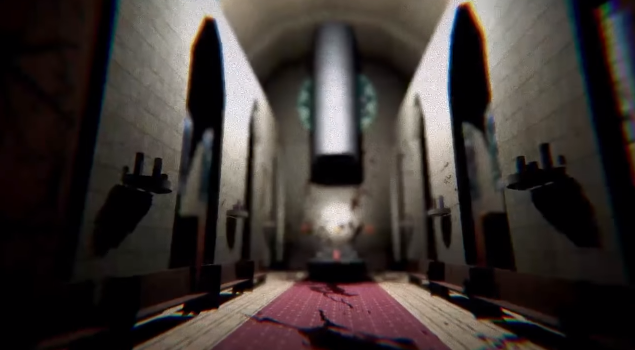
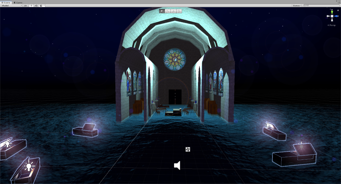
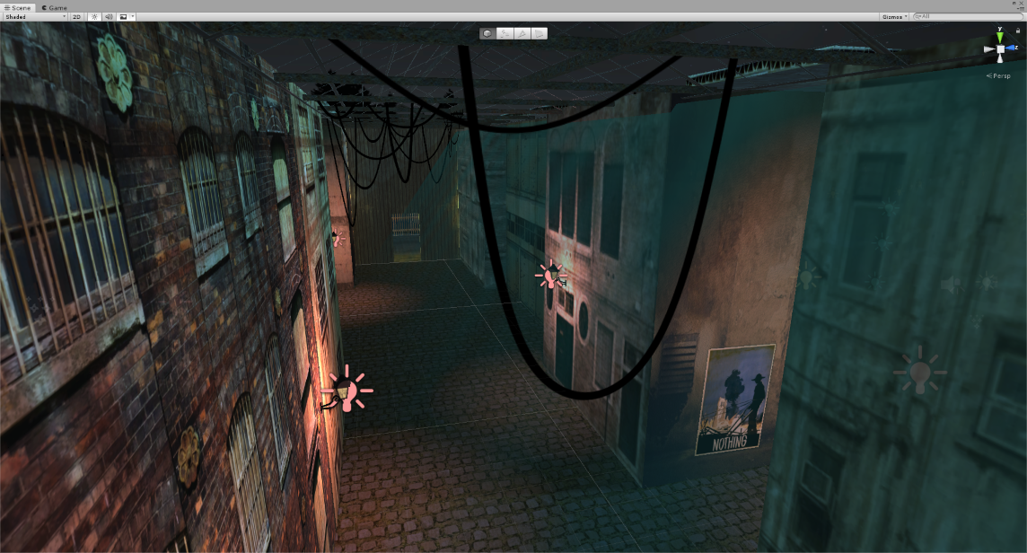
I lost myself adding details to the environment. Details that might not even be noticed. The chapel has a short message written in its stained glass windows, for example. Also the propaganda posters are somewhat linked to the dioramas, as each of them are about a different kind of loss or grief, and are meant to influence the player in their answers, as well as directing them in the environment. Some posters are positioned on the side of buildings, or at the entrance to an alleyway, in order to encourage exploration and hopefully direct eye movement to what would normally be neglected parts of the game map. Other posters are placed deep in alleyways to reward exploration (as I assumed, perhaps mistakenly, that players would be curious to see all of them and thus would be willing to explore the town all over for them) and confirm player intuition that going out of the main streets is the thing to do.
Players seemed to have trouble finding all ten stations, even after all the subtle precautions I added (visual and audio clues of different natures were attached to each diorama). I modified the early designs of some parts of the map, deleting a building here or changing a brick wall for a see-through fence there, to help make things clearer. But I really wanted to encourage player exploration. If we are to borrow Richard Bartle's taxonomy of the four core types of gamers, I definitely am an explorer over all else. The main fun I get from the games I play is witnessing the environment, walking through it, observing every little space until I know it as if I've actually been there. I predict that most, if not all, games I will make in my lifetime will be geared towards this player profile exclusively. Releasing a game for all players to play will invariably lead to this clash of gamer personalities and expectations, and I openly accept that my games, for this reason and many others, are not for every type of player out there.
THE STAR
---
I have a confession to make : the whole psychological test frame for the game was an afterthought.
Yeah, I know. Its biggest draw, the only true reason for its success was something I did not consider until the very end of development (we're talking the actual last week of development!). I initially intended TSOTG as a tool for self-exploration, somewhere between a gothic horoscope and a grim tarot card reading. Yes the different answers have a hidden value, feeding into a test matrix, resulting in one of the different endings, and I tried my best to implement those values as fast as possible in order to forget them and keep the test as inscrutable as possible for even myself.
There are five possible main outcomes in the software. By outcomes, I mean that the answers you give the game will change the last environment visited, the chapel. Each represent a type of grief, or loss, as it is the true theme of the game. After the chapel segment, a short message appears, as a final send-off before the software closes by itself.
Those messages are absolutely meant to be random, within some parameters. Each of the five endings all have their set of five messages that can appear randomly, each grouped by type of loss or grief (for a total of 25 possible ending combinations) . This was meant to reproduce the surprising and obtuse nature of a horoscope or tarot reading. I wanted to provoke the pattern recognition part of the player's brain and attempt to force them into analyzing the final random message and draw personal meaning from it, instead of presenting the player with a straightforward report card. We'll talk about the reception of this decision later in this postmortem.
Those messages were written and rewritten at least four times. It drove me crazy. At first, they addressed each type of grief in a direct manner. I researched official advice from professionals about loss and how to deal with tragedy, big or small, and I intended to give good, sound advice. But at some point halfway during development, it felt like this broke the surreal, subtly suggestive immersion of the rest of the experience.
I rewrote the messages to be less direct in their advice. And then I just...removed words, until they became unrecognizable from the first draft. I reached a point of obfuscation I found satisfactory, and I left it as is. Again, I know this wasn't received all that well by players. It appears some players expected a revelatory message to end the experience, something I did not feel confident I could deliver, this time around.
One last thing to say about the end messages is this : Unity 3D's randomizing function is straight up broken. It puts forward a certain subset of possibilities and does not consider the other ones from a given list. In other words, the randomization is biased. From all the playthroughs I've watched online and all the result forms I've received, I can safely say that some of the final messages are almost never shown (I also suspect that, since there are at least two endings that are reached less often than others, some messages potentially have never been shown at all). I've seen Unity assets online that promise a better 'randomizer' function than the native one in the software. It seems to confirm my suspicion and makes me somewhat regret my decision to rely on it so much. But then again, how could have I known?
THE TOWER
---
Players loved the game environment, overall. They loved the ambiance, the immersion and the unique paper-doll visuals. But most of them were disappointed by (or straight up hated) the end results. That obtuse ending in the chapel, the seemingly nonsensical fortune-cookie style message they were left with. Is it a testament to the goodwill the first half of the game gathers during playtime? Like, I really nailed the quiz portion but failed the landing in the results phase?
Perhaps.
But I'd rather admit to another failure, one I feel really gets to the heart of the problem of TSOTG : I did not communicate the nature of the experience correctly. To me, the software I made is a tool for self-exploration, and the psychological test angle was supposed to be seen as meta (including the post-game communication where I analyze the forms player send me) and was, in the end, sort of an afterthought. But I seriously underestimated people's genuine interest in psychology.
The game spoke to an audience I was not expecting to ever reach. Some people find solace, perhaps even some salvation, in psychology, psycho-analysis and introspection. It becomes a subject that is near and dear to them. Those people love to explore their minds and minds of others. Obviously this audience was drawn to the promise of an actual psychology test and ended up with what amounts to a fancy tarot reading. They were quite vocal in stating what I thought would be obvious : that this test was not thorough or scientifically sound.
I understand the frustration. And the blame I'll take upon myself is what I stated earlier : I failed to properly communicate the meta-frame of the experience, that in the fiction of the game there is this fake nameless organisation that monitored the tests, and that in the actual reality the test isn't all that serious. In no way would it survive psychologists' peer reviewing, because it wasn't the point. But alas I did not state it clearly enough. Or stated it at all.
After the first wave of playthroughs started to appear online, I did add all sorts of warning and statements about how the test is not a valid form of evaluation and is made for entertainment purposes, because this is when I started seeing the confusion in some players and honestly got scared the experience might be taken seriously. The blurb on the game store page, and the in-game text, was probably managing to sound 'clinical' and 'professional' a little too well.
So...sorry about that, guys. My bad.
THE HERMIT
---
Yet, I understood early that the psych eval part of the game was something that intrigued the first few players (mainly while the software was in QA, with close friends playing it for the first time) and I suddenly thought of the one feature TSOTG needed to distinguish itself from the rest : what if the 42-B evaluation form that the in-game text referred to actually came with the game? What if I included an actual functioning email in the form so that players could send the report to this nameless organisation?
Then, as soon as the game came out, I received a form. Somebody actually sent it to me. I was amazed. The level of trust required, the strength of the unstated bond between indie game dev and player needed for this to happen felt humbling. You guys are courageous, to say the least. And so another crazy idea came to my mind : what if I actually responded to those forms?
Yes, you read that right. All of it, the psych test angle, the evaluation form 42-B and the analysis form 73-D you get in return...it was all made up on the fly. And I am not a psychologist but a rather confused, disorganized airhead of a game dev . Quite the pretender, heh?
While I am on the subject : I know all you have is my word for it, but apart from writing a personalized analysis in response to the form 42-B you send to the somewhat software email address, I am not doing anything with the information included in the forms, nor your email addresses. The information given in the form 42-B is only used in context with the game, and is forgotten and deleted shortly thereafter. I have seen people express concern about this online, and I share your concern. We live in very cynical times, but rest assured your secret is safe with me. I initially had some interesting observations to make about all of the forms I received, but after consideration I will not disclose anything about them.
What I can say is that at the time of writing this, I received more or less 200-250 forms. The game was downloaded about 3k times so we could determine a response rate of about 8%. Which is a better rate than I ever could have imagined. I foresee the moment in the near future where I will stop to support the personal analysis and stop responding to the forms 42-B I received. I will then remove the form from the game download bundle and mention it on the game page.
JUDGEMENT
---
Shortly after the release of TSOTG, there was that a game with a premise similar to it that was also released. Perfection is a game that, unlike mine, properly explains what it's about on its game page, and executes its design in a clearer, more straight-forward way. I haven't seen much comparison online between the two experiences, but what few comments I could find in that regards seemed to point to Perfection having a better execution of the idea. To which I agree, as discussed above.
But the interesting thing about it was the test results. From what I've gathered, some players were similarly disappointed by the results offered by Perfection, as it attempted to profile them in a more direct manner with a completed form at the end of the game. Perhaps the idea of making a game that is also a personality quiz is a difficult endeavor that will invariably leave some players wanting for more. An ideal psych eval software would take years of development, testing and would have tons of psychology doctorates to go over it. And an indie game with a small dev team cannot possibly aim realistically for such a final product, and it most certainly would not give it away for free to the general public.
After observing players' mild discontent about more direct personality test reports, I am confident in my choice of making the results of the quiz some abstract answer that attempts to elicit some visceral and subconscious reaction in the player. It feels like a better way to go about it, as it allows better repeated plays and encourages even more critical analysis and, hopefully, introspection.
STRENGTH
---
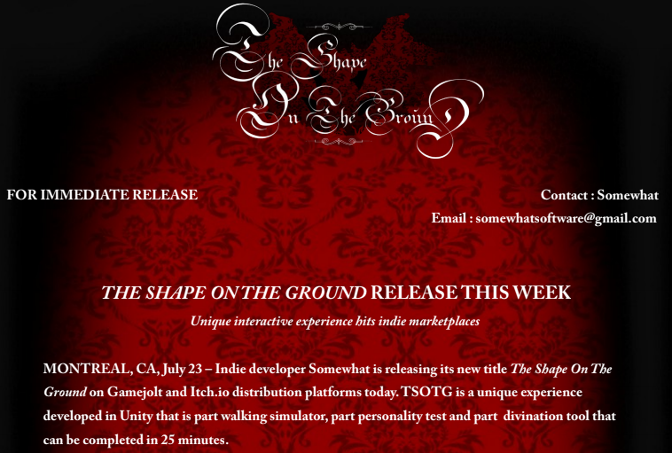
One thing I did not do for the preceding title I Make Saints was to create a press kit and contact people and blogs about the game. It was a first title, I was a nobody (still am, for all intents and purposes), so why anybody would care about a game with such a grim subject? But for TSOTG, I was admittedly a little more confident it had a wider appeal.
I made a nice PDF file with all the information about the game, added a few screenshots, collected emails of some targeted blogs and websites (places I knew there were writers interested in weird, short, quirky experiences) and took a shot in the dark.
Turns out it worked quite well. The response was as good as I believed it could be, considering the unique nature of the software, my lack of a reputation on the indie scene, etc. TSOTG gathered some nice comments online and it's all that was needed to keep me motivated to keep working on another game.
What I am concerned about is that The Shape On The Ground might make me a one-hit-wonder. It was a modest success, but it reached an unexpected audience, people into personality tests and other player-centric psychological explorations. My current and future game ideas do not reflect the inspiration I had for TSOTG, and so this new audience cannot be taken for granted. It will be interesting to see how many people stick around for the weirdness to come.
THE MOON
---
Somehow I feel I will be coming back to the visual style of TSOTG. It just seems like I didn't go all the way with my exploration of the stop-motion / papier-mâché / miniature look. But that's a common observation when it comes to my work : limited attention span and no clear pre-production makes it difficult to really dig deep into any concept.
Also, lesson learned, I'll steer clear of meta-fiction for the time being, since it was obviously an issue with this software and how I communicated its contents. Simplifying the theme and clarifying the message to manage players' expectations are easy enough to do, but are often at odds with my tendency to encourage players to just boot up the game without knowing anything obvious about it. As I stated in an earlier Postmortem, I love the rather romantic idea of playing a weird game you know nothing about, or at least that you don't entirely understand at first glance, alone, late at night. This vision will be addressed in a more direct capacity in my upcoming project \SPEK.TAKL\, but I acknowledge that I need to be more careful about deliberate obfuscation.
Hopefully, this window into how TSOTG software was made offered you pertinent insight, and perhaps shed enough light on its facets to make you curious about playing it again (or for the first time!). Maybe I even convinced you to see the project as it was naively first intended : being a tool for personal introspection, a virtual tarot reading you might want to revisit sporadically.
Get The Shape On The Ground
The Shape On The Ground
A psychological test
| Status | Released |
| Author | somewhat |
| Genre | Adventure |
| Tags | Altgame, artgame, Atmospheric, Experimental, Exploration, Gothic, Halloween, Horror, Psychological Horror, Walking simulator |
| Languages | English |
More posts
- Version 2.0 Now AvailableJun 14, 2021
- Through The StaticAug 28, 2018

Leave a comment
Log in with itch.io to leave a comment.